Redefining Protective Solutions in a Crowded Market
Despite 30 years of manufacturing expertise, Bags and Gloves faced a positioning crisis. The brand communicated as a commodity supplier, emphasizing machinery and certifications rather than partnership and innovation.
Fragmented social media, uninspired product photography, and cluttered trade show booths failed to differentiate from larger competitors. To command loyalty, B&G needed to move beyond functional competition and craft a compelling story rooted in heritage, collaboration, and forward-thinking innovation.
Building the Blueprint: Collaborative Research & Strategic Foundations
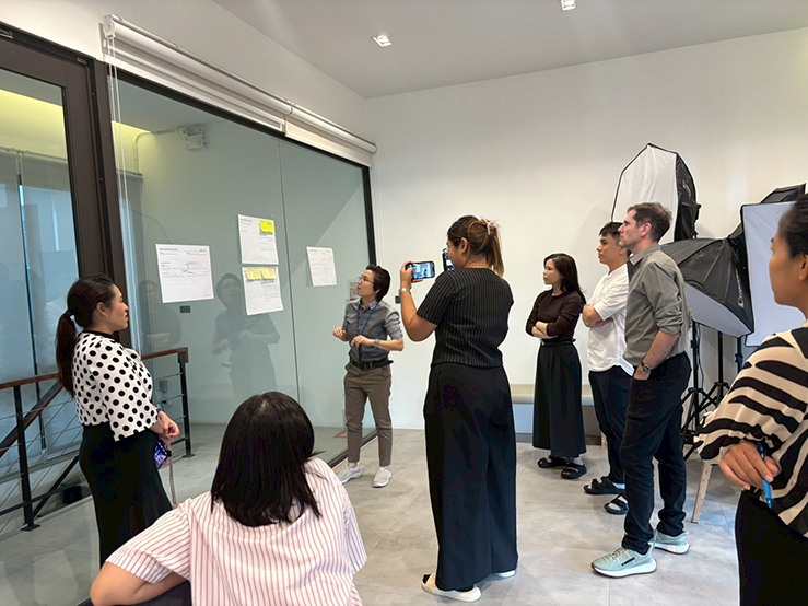
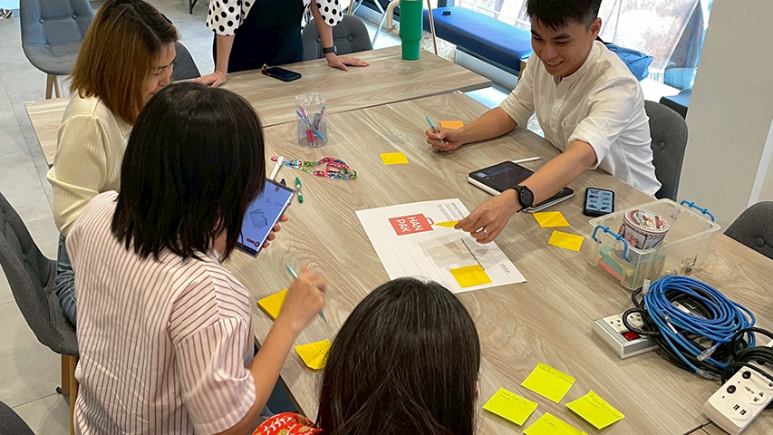
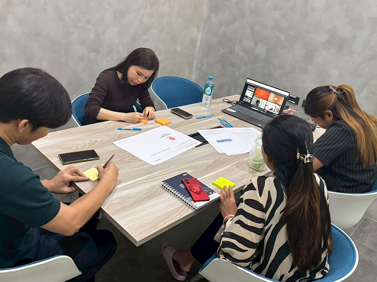
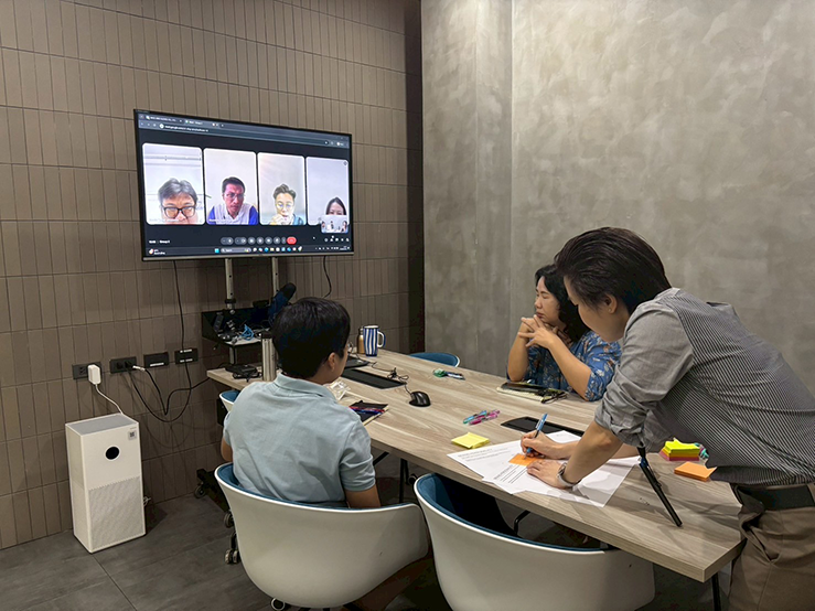
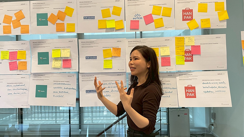
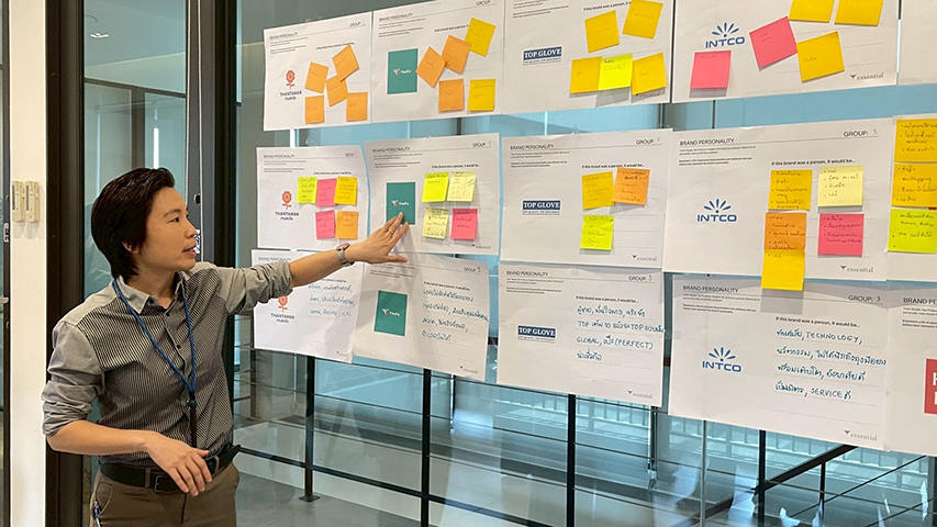
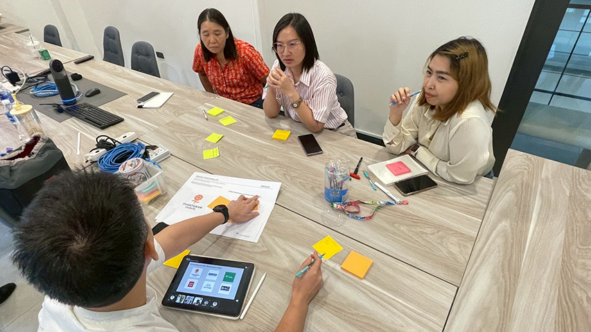
Essential Studio conducted an in-depth discovery phase with B&G stakeholders—spanning production, sales, marketing, and leadership—to establish strategic foundations before any visual design work began. Through facilitated workshops and collaborative sessions, the team explored fundamental questions: What truly differentiates B&G from competitors? What compelling story remains untold?
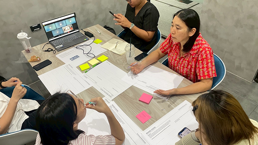
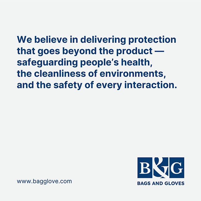
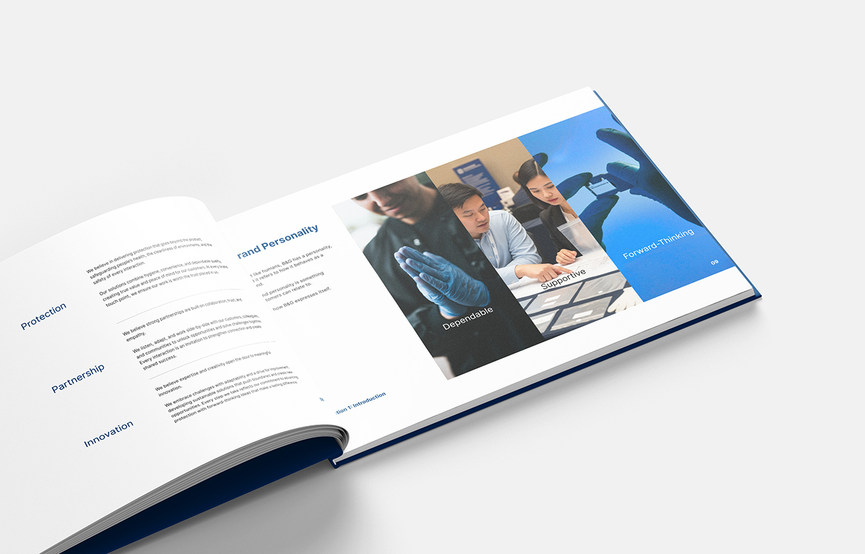
The research revealed a critical insight: B&G’s genuine differentiation lay not in machinery or certifications, but in partnership philosophy, innovation commitment, and operational excellence. By synthesizing findings into a cohesive brand platform—Mission, Vision, Core Values, and distinct Personality traits—the team created a strategic anchor for all subsequent creative decisions.
This foundational phase proved absolutely essential. It ensured every design choice was grounded in authentic strategy rather than aesthetic preference alone, and secured stakeholder alignment, transforming brand revitalisation from a design project into shared organizational transformation.

Preserving Heritage, Embracing Partnership
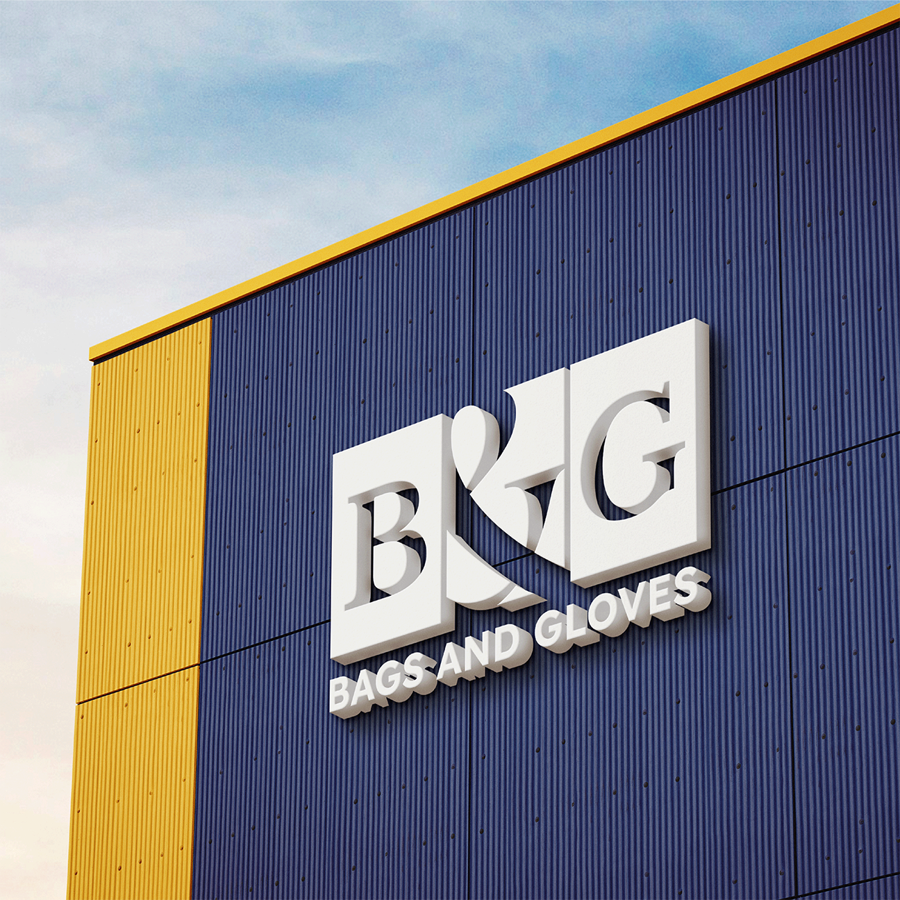
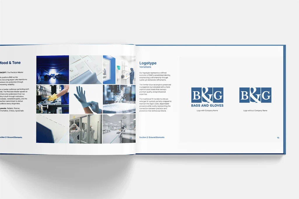
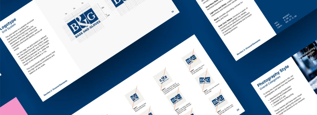
The redesigned logo preserves B&G’s iconic blue rectangle; elevated to Steel Navy for premium quality; while replacing the letter ‘A’ with an enlarged ampersand (&), partially cropped within the rectangle.
This shift signals “and,” celebrating both protective products and collaborative partnership while preventing the brand from reading as a single word.
The geometric cropping reinforces craftsmanship, representing the intersection of meticulous manufacturing and human connection.
The Precision Master: Typography, Colour, and Graphic Language
Built on the concept The Precision Master, the visual identity establishes B&G as a manufacturing expert transforming precision into protection.
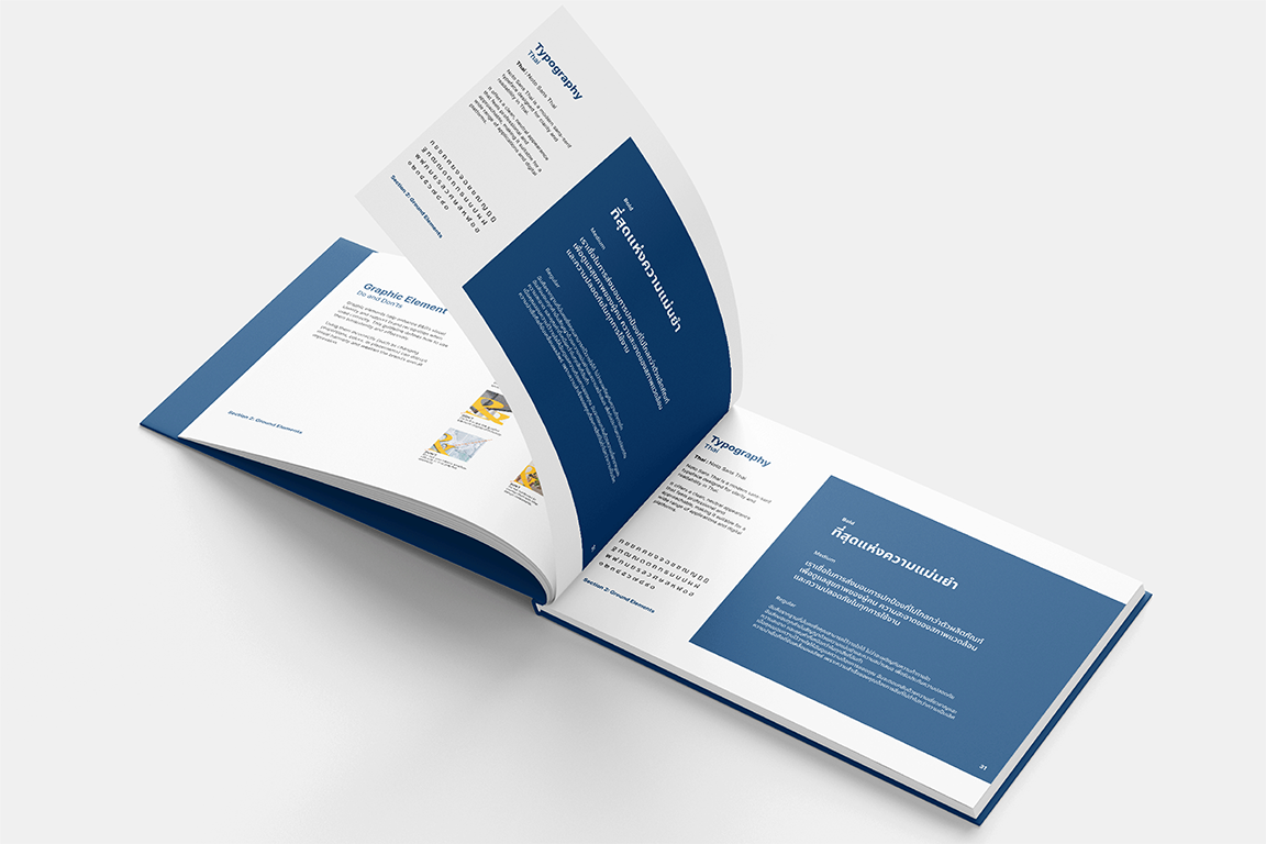
Typography: Inter—a geometric sans-serif with clean lines—mirrors meticulous craftsmanship. Noto Sans Thai handles Thai communications with clarity and approachability.
Colour Palette: Steel Navy Blue conveys technical expertise and trust. Light Grey and White underscore cleanliness and standards. Black provides grounding contrast. Solar Core Yellow introduces innovation and highlights key details. A secondary palette of six complementary hues adds flexibility while maintaining professionalism.
Graphic Element: The ampersand’s slab endings transform into a versatile linear system symbolizing cleanliness and precision. Multiple crop variations adapt seamlessly across applications from social media to packaging overlays.
Systematic Clarity Meets Functional Excellence
Packaging Design prioritizes user recognition: large product imagery, clear specifications organized for quick scanning, and bold Steel Navy and Solar Core Yellow for shelf standout.
Solar Core Yellow functions as both visual highlight and functional accent, creating rhythm across product ranges. Secondary colour variations (oranges, teals) emerge for specific lines while maintaining system cohesion.

Ensuring Consistency Across Every Touchpoint
A comprehensive visual identity guide ensures consistency across every brand touchpoint—from digital to print, packaging to environmental design. Clear parameters govern logo application, colour usage, typographic hierarchy, and graphic element integration, enabling teams to execute on-brand work independently while maintaining visual coherence.
The guidelines balance prescriptive control with creative flexibility, allowing designers to adapt elements for different contexts without compromising brand recognition or professional impact.
Operationalizing Brand Promise at Scale
The true value emerges in scalable execution. As B&G expands production, enters new markets, and partners with global distributors, the manual ensures that every touchpoint reinforces the unified brand narrative.
This disciplined consistency, applied across thousands of daily interactions, transforms B&G’s market perception from commodity supplier to trusted, innovative partner.
Team
Sébastien Maleville
Creative Director
Saranya Kittidechachan
Brand & Graphic Designer
Talit Techavanvekin
Product Designer

Ready to See Your Own Results?
You’ve seen how our strategic design process drives growth for our partners.
Let’s discuss how we can achieve measurable success for your brand, starting with a complimentary strategy session.