A Name That Had Outgrown the Business
For seven years the company traded as Fit Innovation. The name pointed at the gym floor, while the business had quietly expanded into children’s vitamins, calcium for the golden years, effervescents, shots, protein and sports nutrition. It was also generic, hard to protect and impossible to own online. The first task was not a logo but a name.
FYTT keeps the sound people already knew and replaces the expected spelling with a mark the company can own — clean to register, available as a domain and across handles. It reads the same in English and transliterates without friction into Thai, a requirement for a brand that speaks to both Thai pharmacists and international distributors.
Competing for Attention in Thailand’s Most Crowded Aisle
Thailand’s supplement shelf is a wall of near-identical promises: clinical blues, foil finishes, dense benefit lists, a claim of superiority on every facing. Differentiation by ingredient had stopped working, because every competitor made the same one.
Fytt Healthy Innovation had a genuine advantage — more than thirty years of pharmaceutical practice — and no visual system to express it. Each series had been designed on its own terms, so the portfolio read as several small unrelated brands. Distributors found it hard to pitch; shoppers had nothing to recognise from three metres away, the only distance that matters in a pharmacy aisle.

The Natural Explorer: Active Living, Unlocked
A category and portfolio audit established where FYTT could credibly stand. The crowded ground was performance and potency. The open ground was continuity — wellness as something ordinary and repeatable rather than aspirational and extreme.
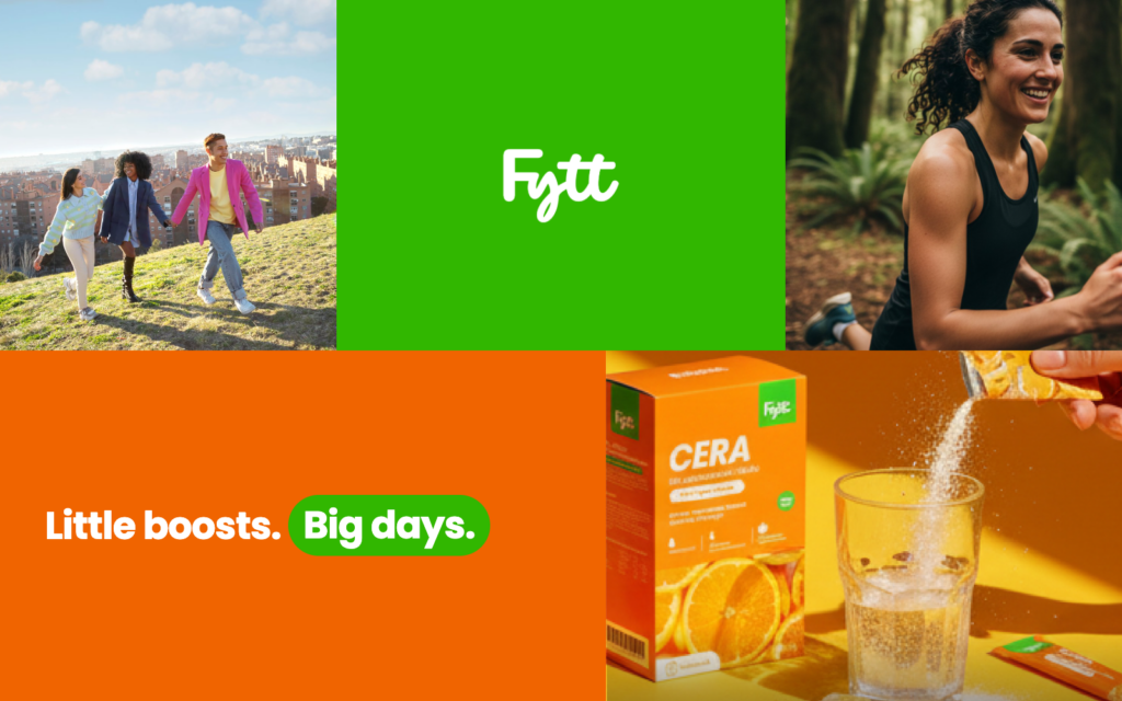
That produced the brand concept and the positioning line Wellness that moves with you, reframing the audience by life stage rather than demographic: kids, mothers, working adults, athletes and the golden years. One brand, five moments in a life.
A Signature, Not a Logo
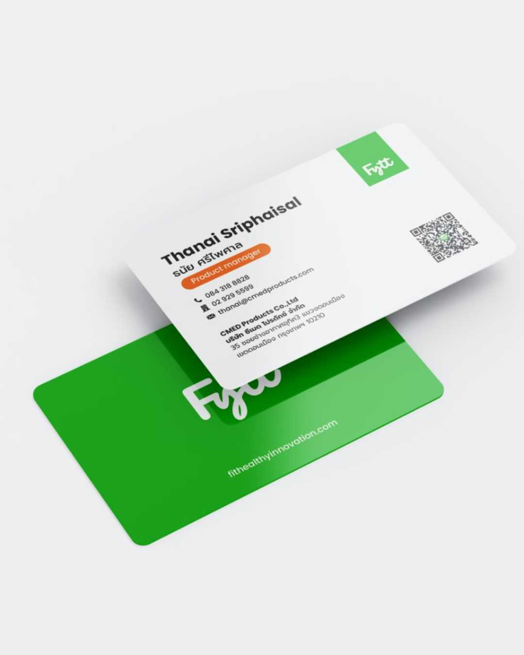
The logotype is hand-drawn script with rounded terminals, deliberately warm in a category that defaults to clinical. It reads as a signature: something a person made, standing in front of products manufactured to pharmaceutical standard. The credibility is in the practice; the approachability has to come from the brand.
The rounded terminals of that script became the source of the entire graphic system that followed.

Verdant Green, Poppins, and the Pill
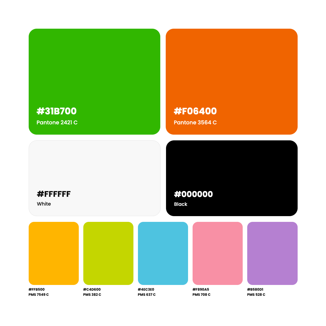
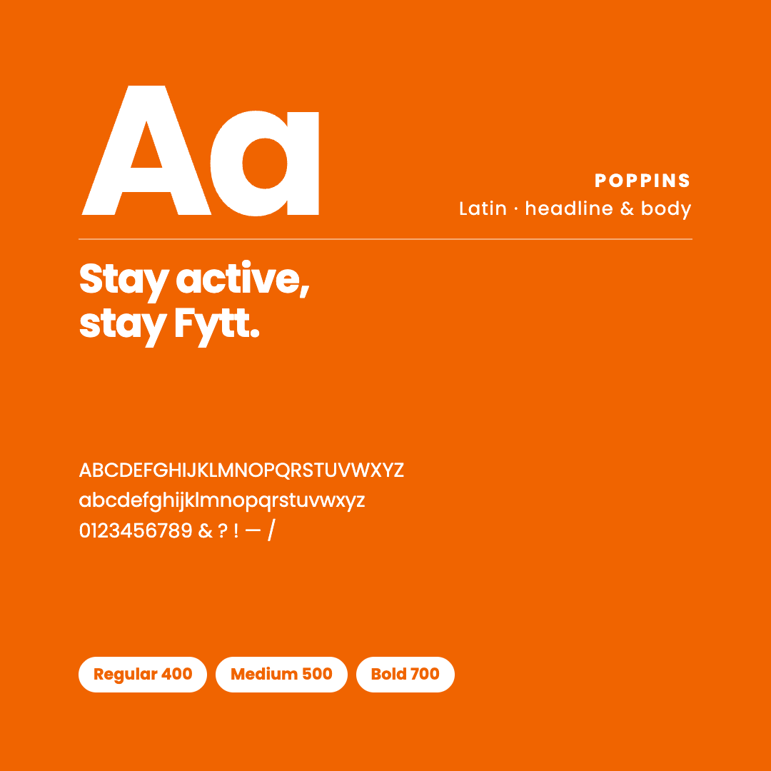
Poppins carries English, geometric and open, echoing the logotype without imitating it; Prompt handles Thai as an equal partner, matched for weight and rhythm so bilingual layouts hold together. Verdant Green and Pumpkin Orange lead, with five secondaries for accent.
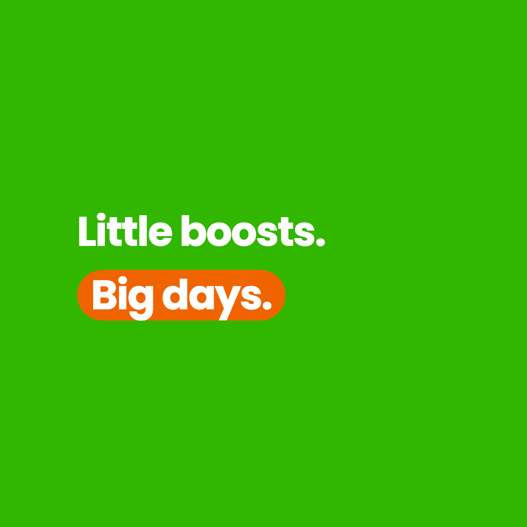
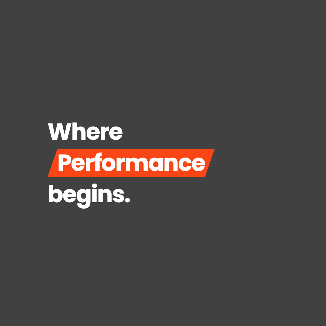
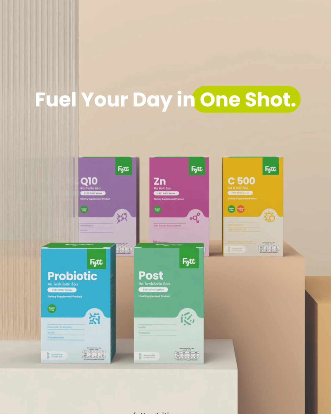
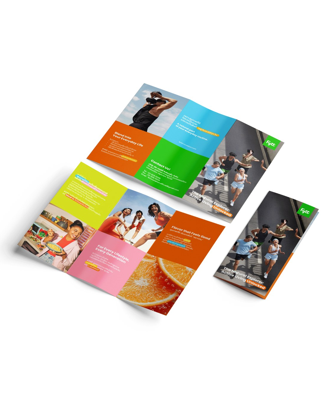
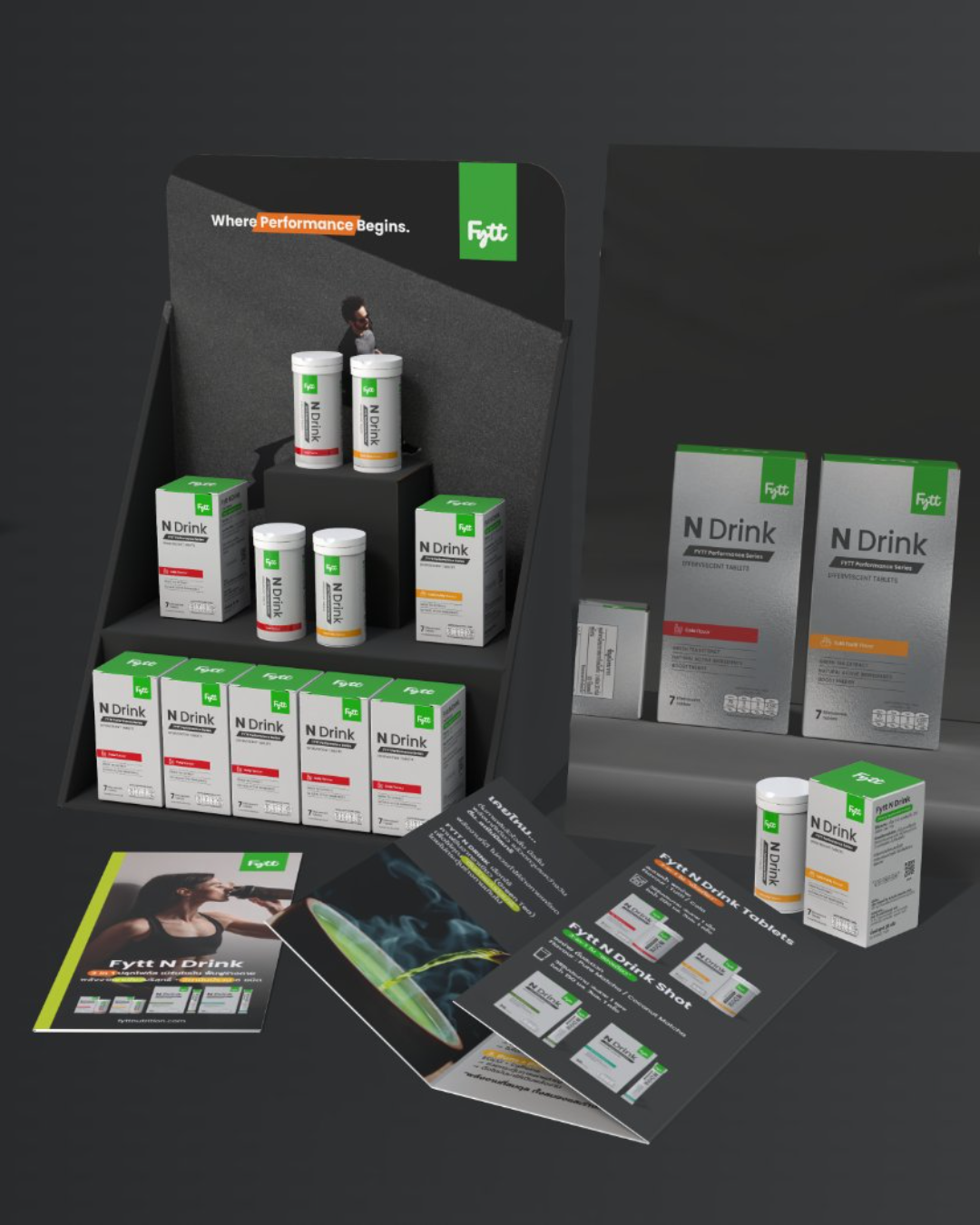
The graphic element is the pill, lifted straight from the logotype’s terminals. It stretches to fit whatever it holds: a marker behind a key word, a category tag, a series identifier, a colour bar. It is the brand’s smallest recognisable unit and does more work than the logo itself. The Performance series inverts it — sharp angled cuts and grey-led tones, for a range that needs to look precise rather than friendly.



One System, Eight Series
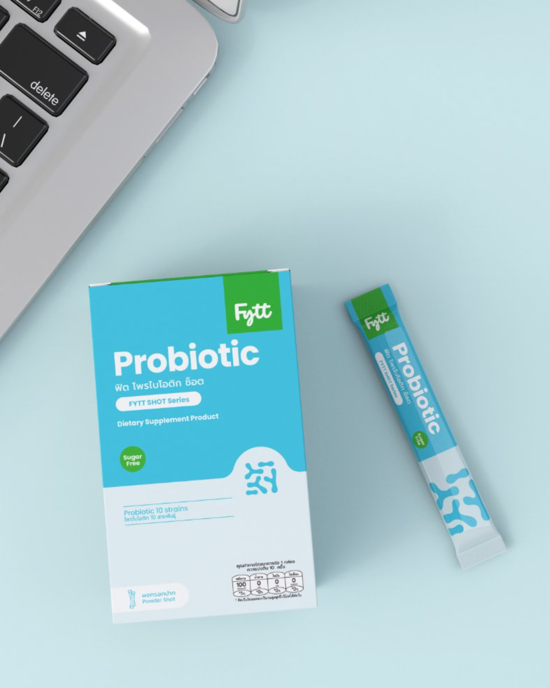
Packaging resolves the portfolio problem with a single rule: a 3:2 split between brand territory and flavour or function territory. The logotype, benefit icons and the dosage block keep fixed positions, and colour follows function logic in some categories and bold flavour colour for most products, putting an emphasize on a key aspect of FYTT, healthy products that are actually tasty with a bold flavours.
Retail and event materials inherit the same discipline. POS follows a fixed reading order — brand, message, action. The booth system, backdrops, roll-ups allow staff to build an on-brand stand without a designer present.

The Same System, On Screen — and On Record
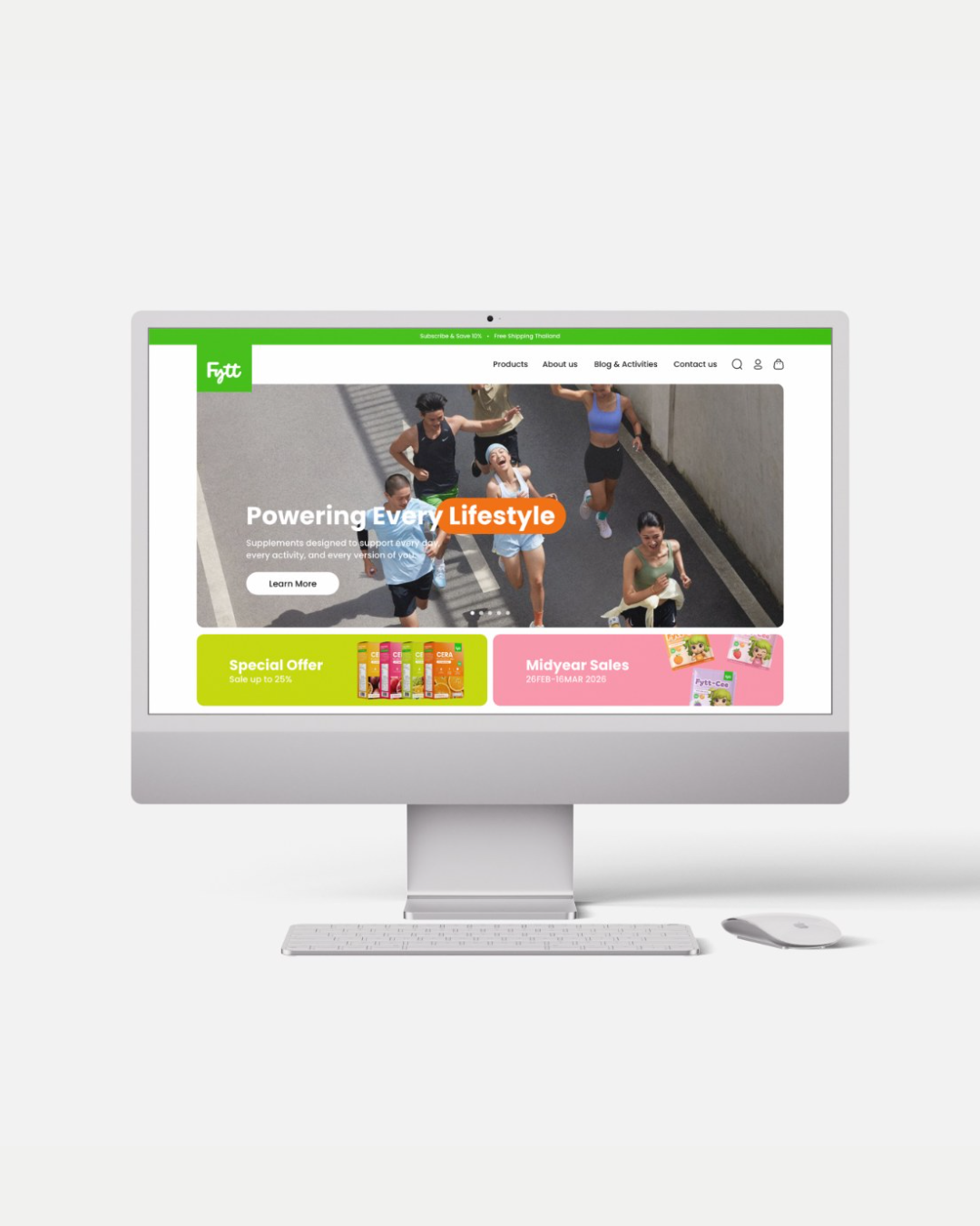
The website translates the print system rather than redrawing it: the logotype in a green tile, a solid green pill on the active nav item, a twelve-column grid and generous white space. Social follows the editorial rule to the letter — lifestyle first, product second, one message per post with the pill behind the words that matter, and the same tone across Facebook, Instagram and LINE.
All of it is documented in the FYTT Communication Manual: nine sections with construction drawings, safe areas and dielines, prescriptive where consistency matters and flexible where creativity earns its place.
What was a portfolio of unrelated packs is now a single system with room to grow — a name FYTT owns, a graphic language built from its own logotype, and eight series that can launch and sit side by side without losing the thread.

Team
Sébastien Maleville
Creative Director
Saranya Kittidechachan
Brand & Graphic Designer

Ready to See Your Own Results?
You’ve seen how our strategic design process turns manufacturing capability into market position.
Let’s discuss how we can do the same for your brand, starting with a complimentary strategy session.