Manufacturing Excellence Without a Voice
For years HLM built its reputation as an OEM partner; producing bio-based packaging to other companies’ specifications, under other companies’ names. The expertise was real; the visibility was not. There was no consumer-facing brand, and no single home for the sustainable-only initiatives, products and community the business had been quietly building.
The result was a company competing on price in a category that increasingly rewards conviction. To lead rather than supply, the business needed a brand of its own — one that could stand in front of B2B buyers, retailers and partners and make sustainability feel like an upgrade rather than a compromise.
A Strategic Platform Built in Partnership
Essential Studio worked alongside an external strategy consultant to establish the brand’s foundations before any visual work began. Together the teams interrogated the fundamentals: who the brand serves, what it refuses to compromise on, and what story only this company could credibly tell.
The work produced a defined mission, vision, set of core values and personality — and a brand concept that anchored everything that followed: Earth’s Advocate. Not an activist and not a lecturer, but a guardian: a brand that bridges cutting-edge sustainability with something closer to maternal care.
That platform did two things. It gave every later design decision a reason beyond taste, and it aligned leadership around a single ambition before a single line was drawn.
A Name That Carries the Mission
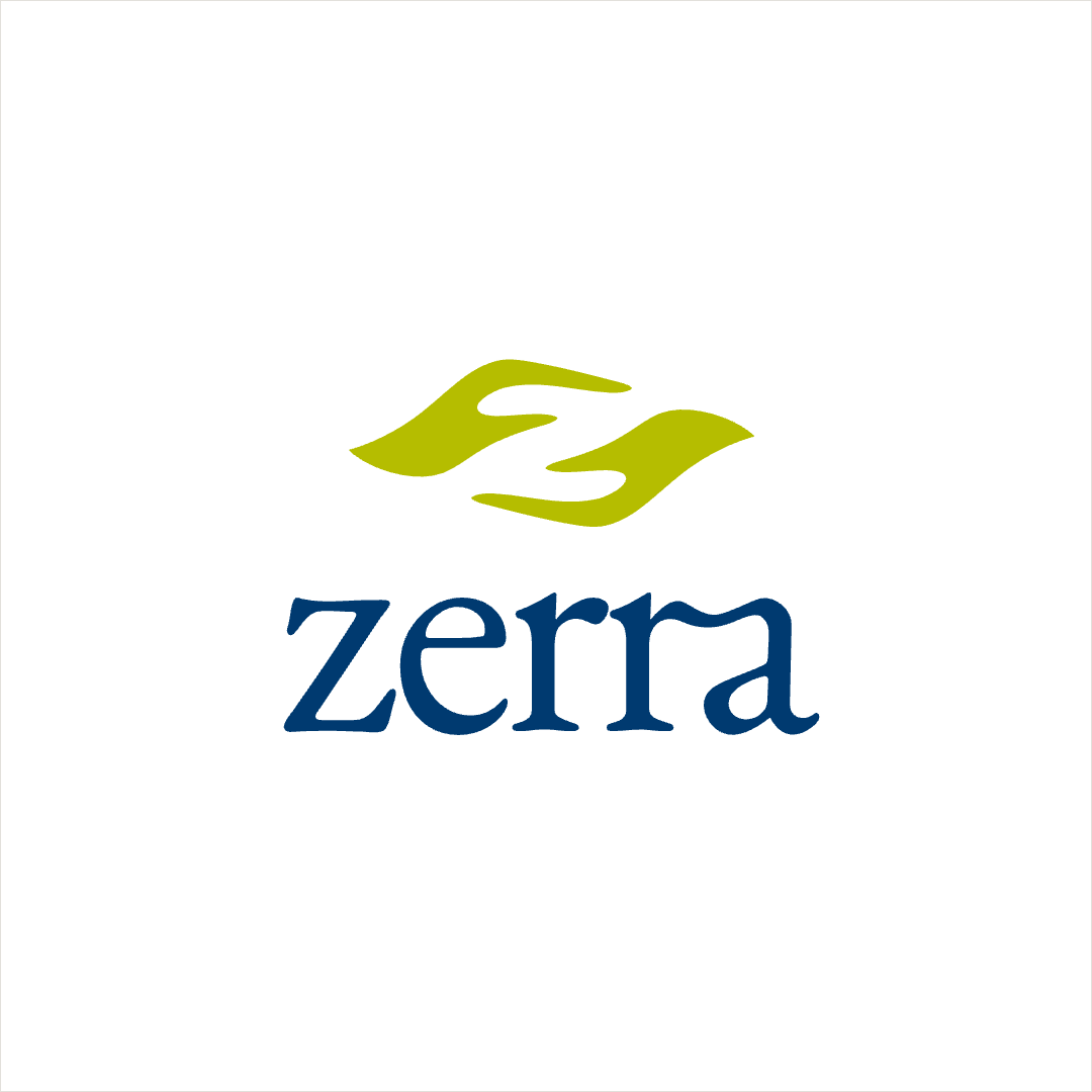
Zerra joins zero — zero waste, zero compromise — with terra, the earth. Short, ownable and pronounceable across markets, it states the mission without explaining it, and leaves room for a company that intends to grow well beyond packaging.
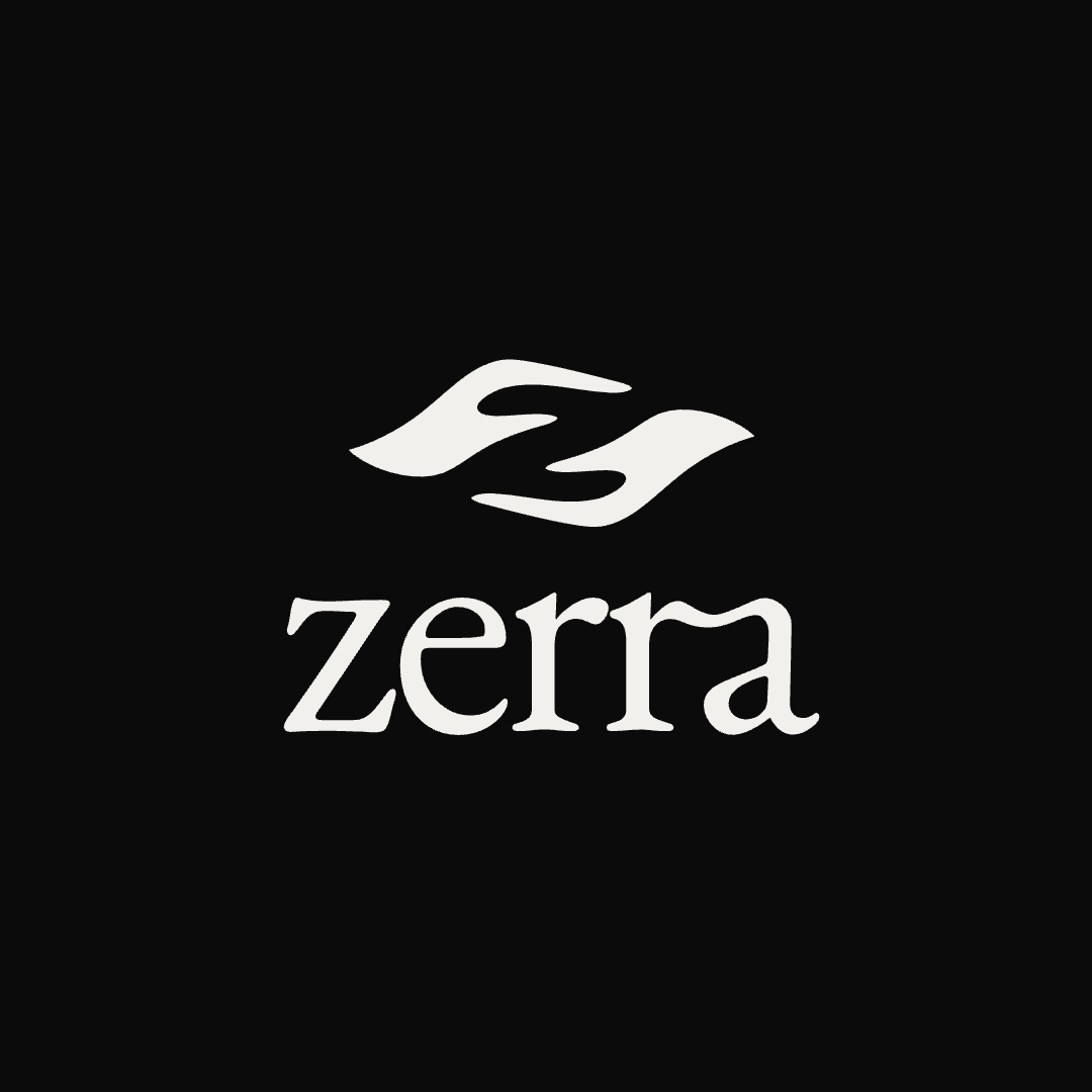
A Mark That Moves Like Nature
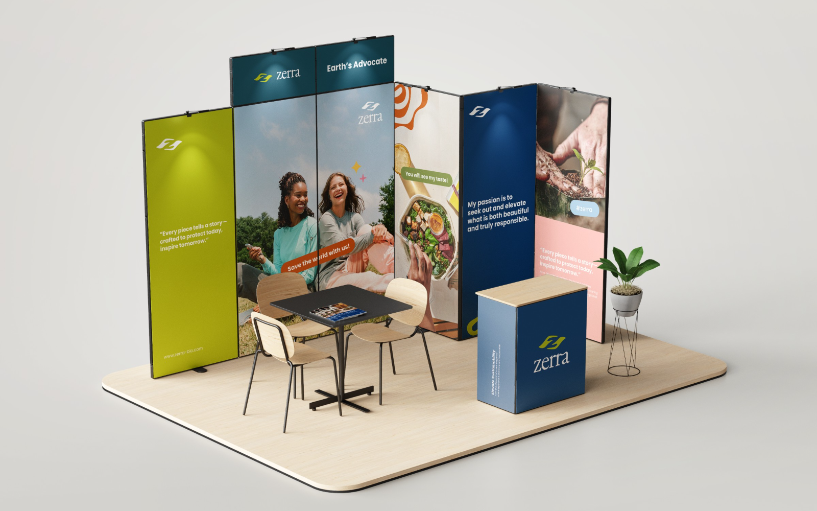
The Zerra symbol reads as two forms in motion — leaves, hands, currents — folding into one another, drawn in a single confident gesture. Protection expressed as movement rather than as a shield.
The custom wordmark’s soft, high-contrast letterforms lend the mark a quiet luxury that separates Zerra from the flat, functional look the category defaults to.
Sustainable Luxury, Systemised
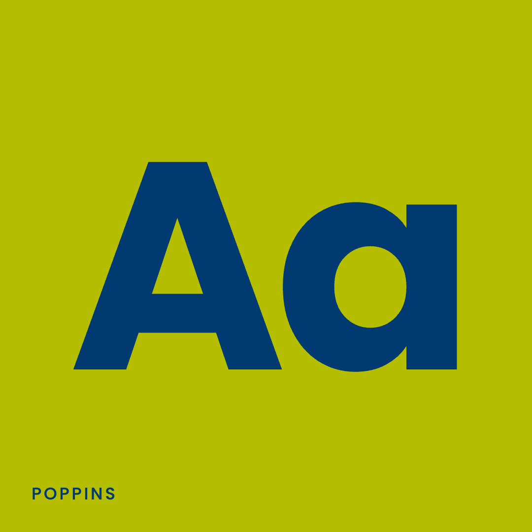
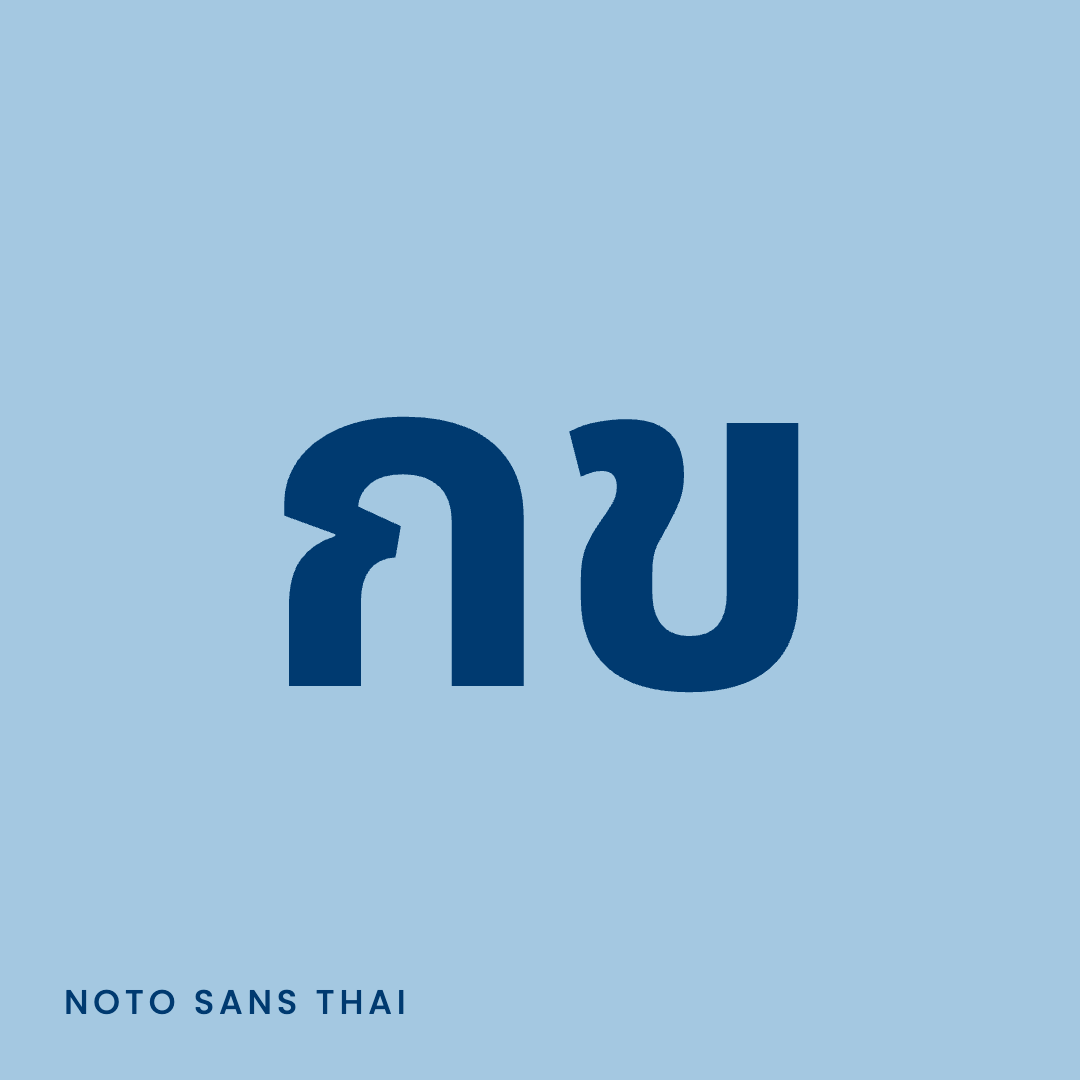
Typography: Poppins, and only Poppins. Its geometric, generous forms carry premium display headlines and dense technical specification alike, without ever reading as industrial.
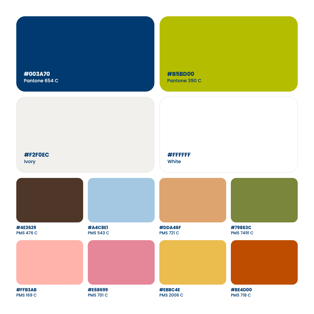
Colour Palette: Navy anchors the system with trust and technical credibility. Lime carries energy and every call to action. A warm Ivory replaces cold white as the brand’s ground. A secondary palette of eight nature-derived hues adds range across product lines and campaigns.
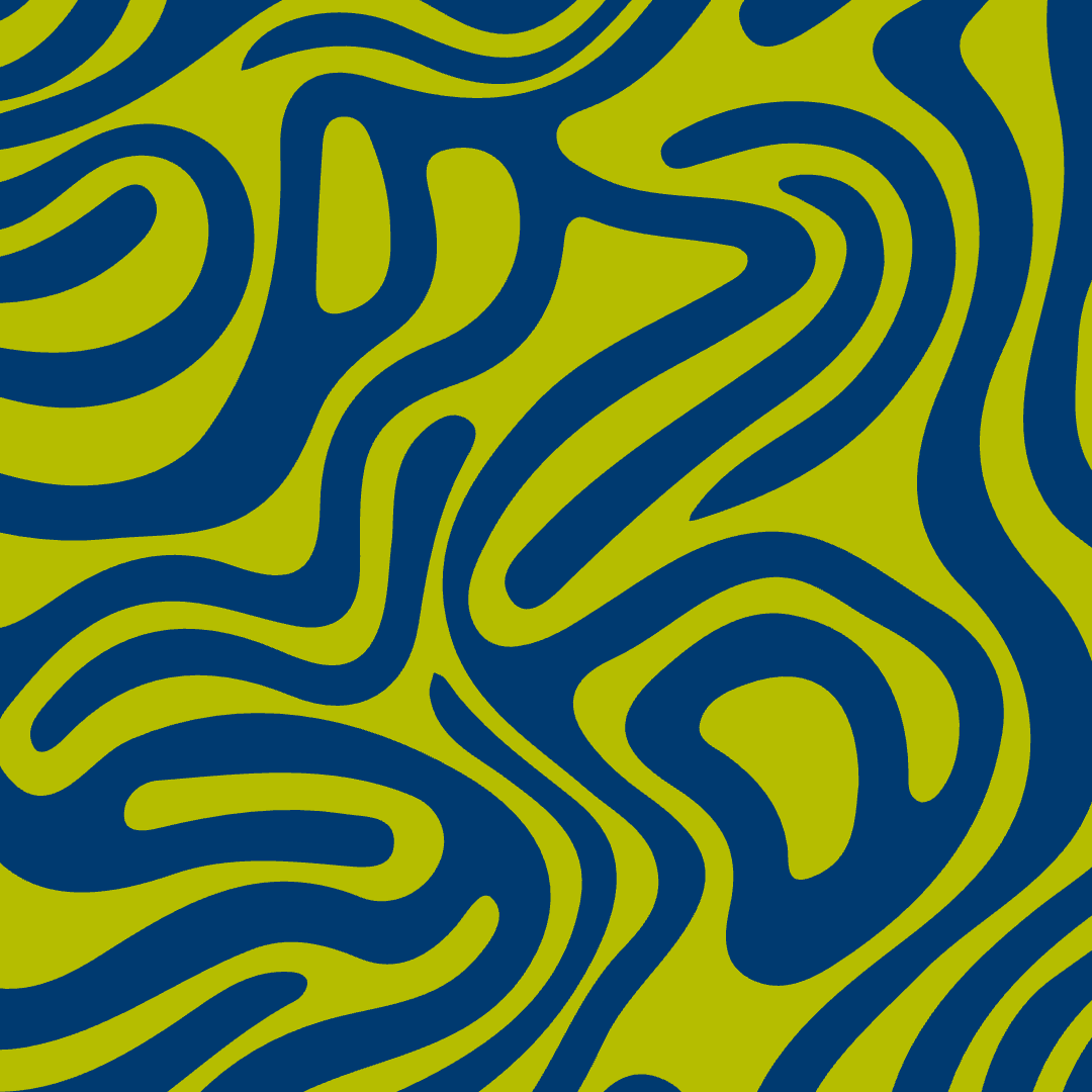
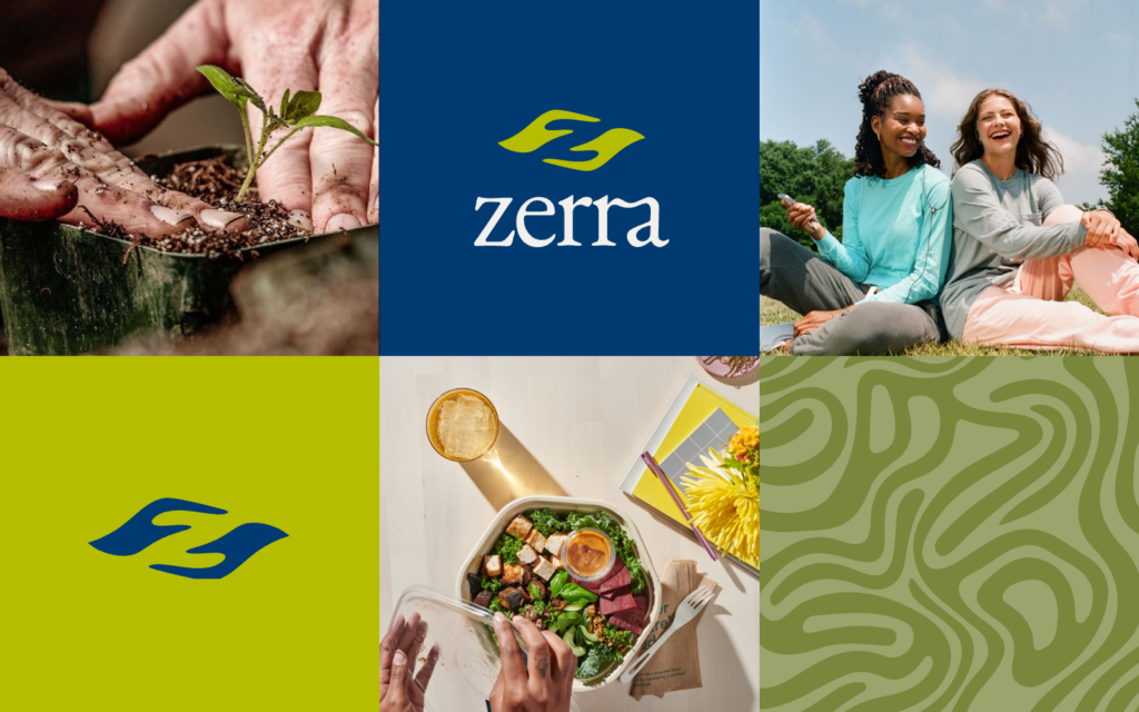
Graphic Element: A flowing topographic line pattern — read it as root networks, riverbeds or leaf veins — acts as the brand’s texture. Cropped large it becomes a full field; at low opacity it bleeds off the corner of a dark section. One element, many scales, no decoration for its own sake.
One System, Every Touchpoint
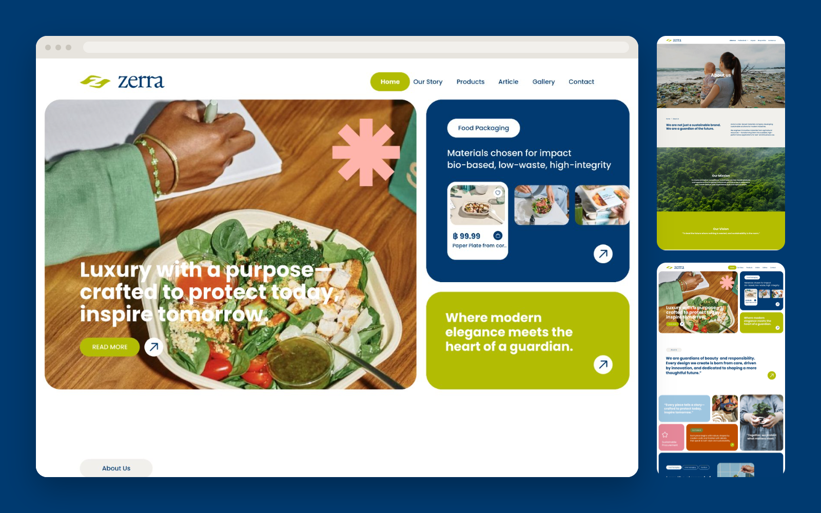
Website: a rhythm of alternating ivory and navy sections, generous typography and full-bleed photography — built to make a manufacturer feel like a brand.
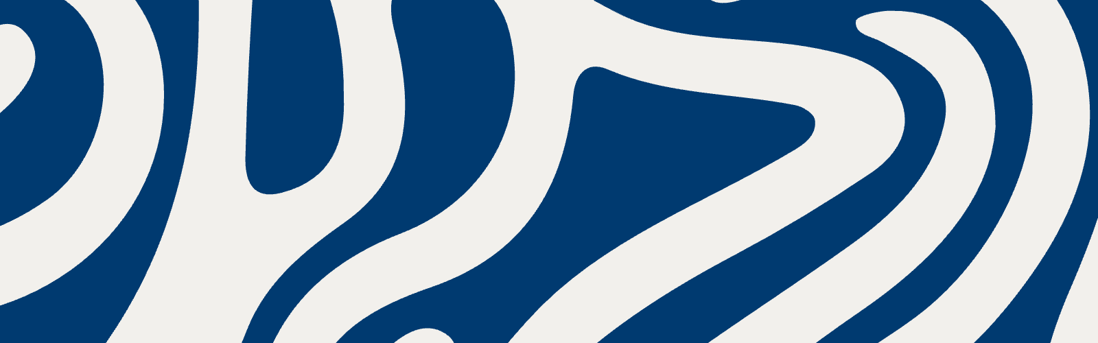
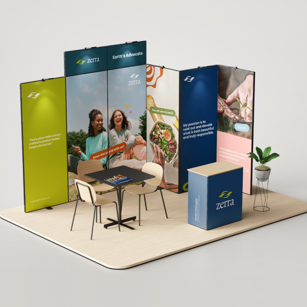
Tradeshow booth and POS display: the identity translated into three dimensions, with bio-based materials, brand-owned colour fields and the graphic element at architectural scale.
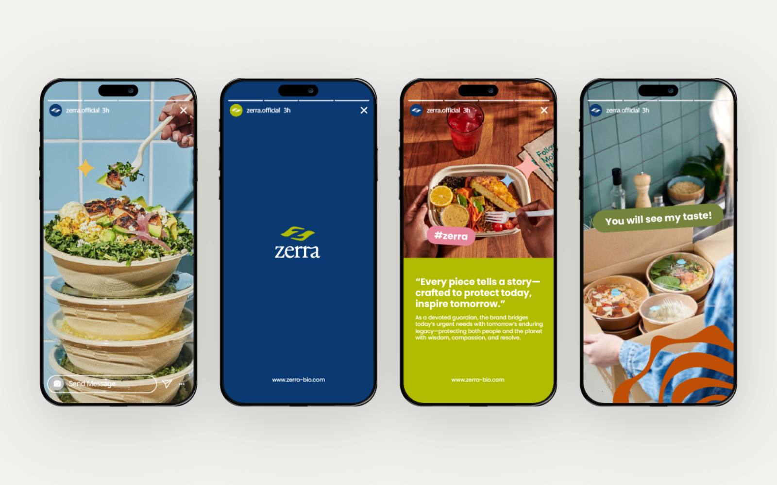
Social media: a template system that lets the team publish independently, at pace, without diluting the identity.
From Supplier to Standard-Bearer
Zerra made its public debut at Thaifex 2026, where the booth, packaging, website and social presence appeared together as one coherent brand for the first time.
What was an OEM capability now has a name, a voice and a face — and a system built to carry it into new markets.
Team
Sébastien Maleville
Creative Director
Saranya Kittidechachan
Brand & Graphic Designer
Ready to See Your Own Results?
You’ve seen how our strategic design process turns manufacturing capability into market position.
Let’s discuss how we can do the same for your brand, starting with a complimentary strategy session.